Building a new brand that resonates.
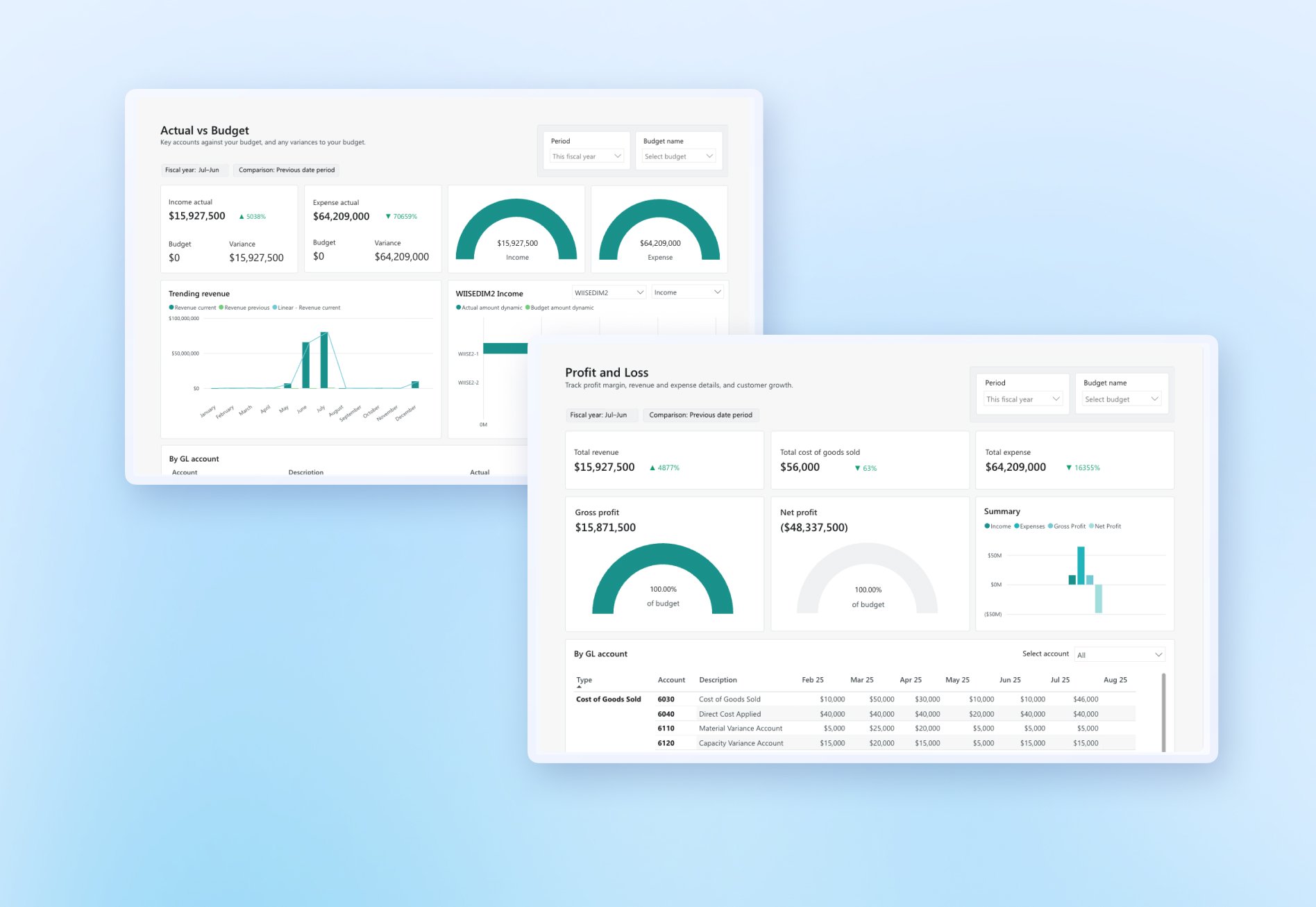
Today, we’re launching our new brand. If you’re reading this then you would’ve already noticed our new website showing off our refreshed logo, bright colours and updated typeface. We hope you’re loving it as much as we do!
We wanted to share a little more about why and how we’ve rebranded. In line with our Wiise values, we’re building trust with transparency.
The making of our new brand...
We surveyed our partners and customers and what we heard loud and clear was that our brand simply wasn't resonating. One customer remarked, "Wiise keeps my professional integrity intact". This was echoed by others, who explained that although Wiise was meeting their business needs the brand look and feel wasn't communicating this.
We knew the change was needed. We had a trusted industry-based product that our customers loved, and a team culture of approachability that was special to us. However, this didn’t seem to be coming across.
So, we evolved a new brand look, this time focusing on our Wiise value. We showed off the new brand to our customers and this time it was met with a lot of excitement. We refined further and continued testing with them until we reached a brand that everyone felt communicated what Wiise meant for them.
A new logo
The most obvious change is our new logo. We started by making it balanced in form as a more modern take on the previous cascading structure. Then, we chose a font that had a subtle roundness on the edges to bring an element of comfort and approachability to the shape.
Finally, the colour. We chose navy blue as honours the credibility of the brand that comes from our ties to KPMG Australia and Microsoft. We placed a more vibrant blue on the two ‘ii’s. This links to the transparency and clarity our product brings to you and your business, while making sure our logo feels fresh and alive. It calls out our two ‘ii’s, as an extra set of eyes over your business. 
Brand elements ...
Our typography
Our main typeface remains Modern Era (created by Family Type). Its designers call out the typeface for its distinctive “pronounced arcs and bevelled stroke joints … giving an idiosyncratic, friendly character.” We felt that this personality matched with Wiise's unique “people-people” approach to ERP.
Our new body typeface is Mulish (created by Google). Like Modern Era it has a warmth to it, along with being clean and legible. 
Our colours
Our colours bring vibrancy to the brand. They’re fresh, bright and modern and they allow us to balance lively innovation with established credibility. They’re used to bring emphasis to certain elements throughout our materials.

Other brand elements
You also may notice a few patterns and illustrations appearing. We chose dots and dashes as together they make up the letter ‘i’ which is such an identifiable part of our brand. Together with the illustrations, these elements aid in our storytelling.

How our brand has been received so far
Feedback from our customers is important ‒ they are the centre of everything we do. This feedback is what pushes us forward and allows us to grow. We tested our new brand with some of our most loved customers before launching, and this is what they had to say:
“This new brand will attract larger enterprise clients as well as be approachable for smaller ones.”
“Love the choice of blue – trustworthy and calming.”
“Clean, professional, fresh. Really tells the Wiise story. It makes complex features easy and functional.”
This is just the beginning
We know that this is not where our brand evolution ends. Like all things Wiise, we’ll continue to learn and evolve as we go. This rebrand is just the start for us. But we hope that you enjoy the journey.
Lauren Hutchins
UX / UI Designer, Wiise
